The Nielsen Heuristics analysis
The Nielsen Heuristics analysis, consists of 10 usability guidelines for design interface and it's very useful to keep in mind when developing or re-designing an app. Dont worry I will focus only on 3 guidelines. Due to time constraints, I was given to redesign an app (approximately 2,5 weeks), creating a complete diary app was a bit out of scope but was it possible… Hell yes!
Focus number 1 visibility of system status:
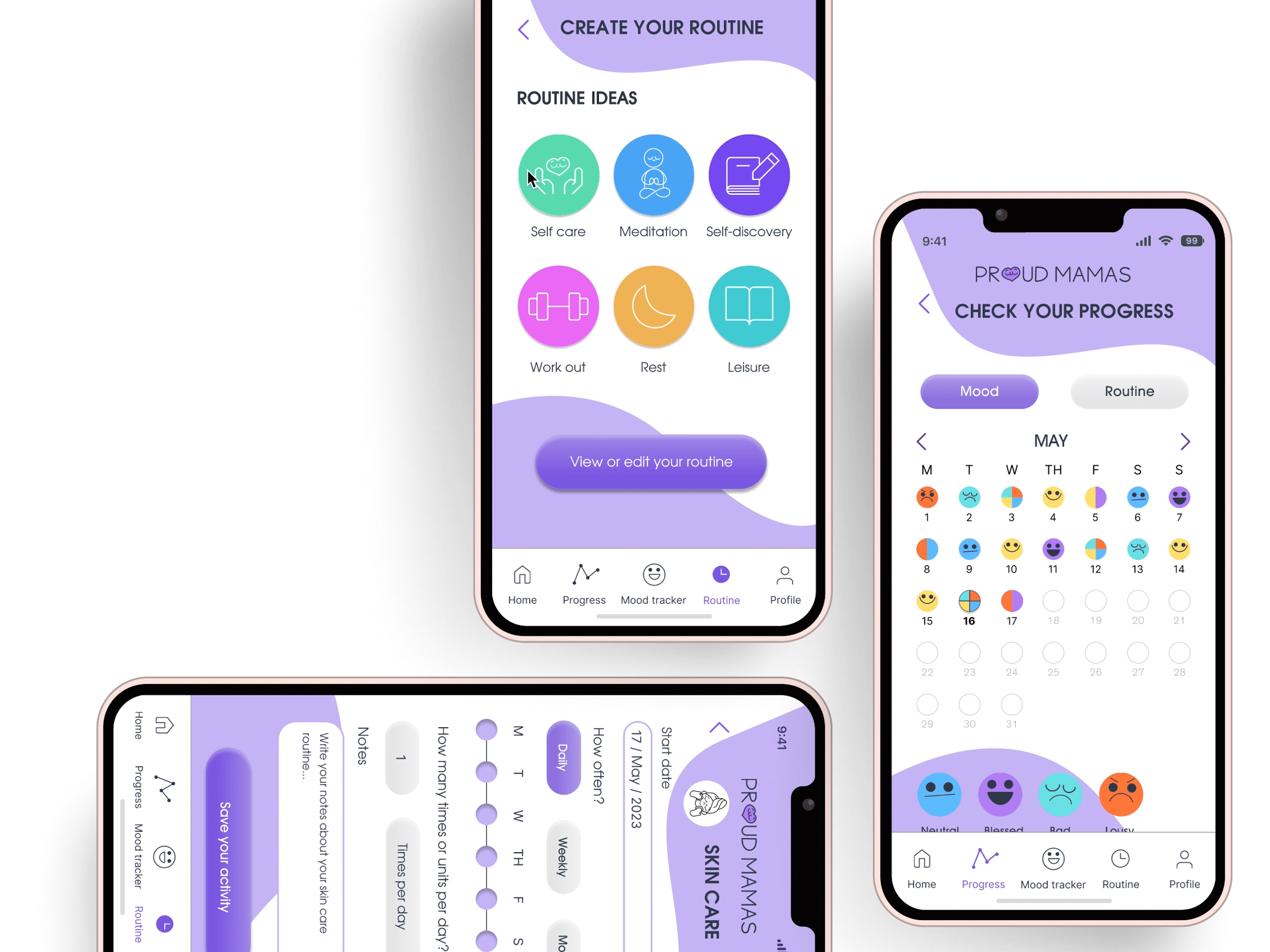
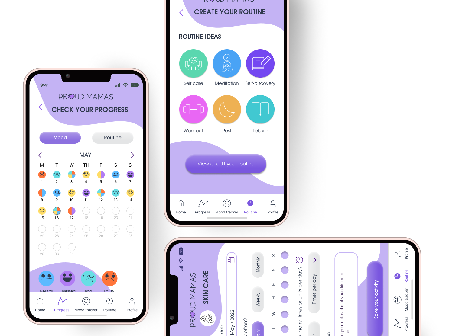
Morning routine & self care app brilliantly keeps us, the users, be informed of what is happening within the app. For example the menu is highlighted depening on which area of the app you are on. The app, also makes it very clear to see, when something is selected, downloading or being saved with a progress circle.
Focus number 2 Flexibility and efficiency of use :
The diary section allows you, to record a voice note, or write down a note. Although there is a flexibility of use it is not efficient. The diary lacks of organisation to easy access a specific note or voice note. Therefore us, the users need to scroll down reading every single title in order to find a previous note.
Thanks MD Kawsar Chowdhury for the amazing iPhone frame!
Focus number 3 Recognition rather than recall
This brings us to the third focus, recognition rather than recall. Due to the lack of flexibility and efficiency to find the note, a user most at least recall the date. By doing this, the user could more or less filters some notes out. In short something needed to be done in order to facilitate the use and avoid having to recall very specific date details.
Therefore to start, I added a recent sections, and a calendar to separate notes or voice notes per day and month.
Let the fun begin The Apps inspo collage:
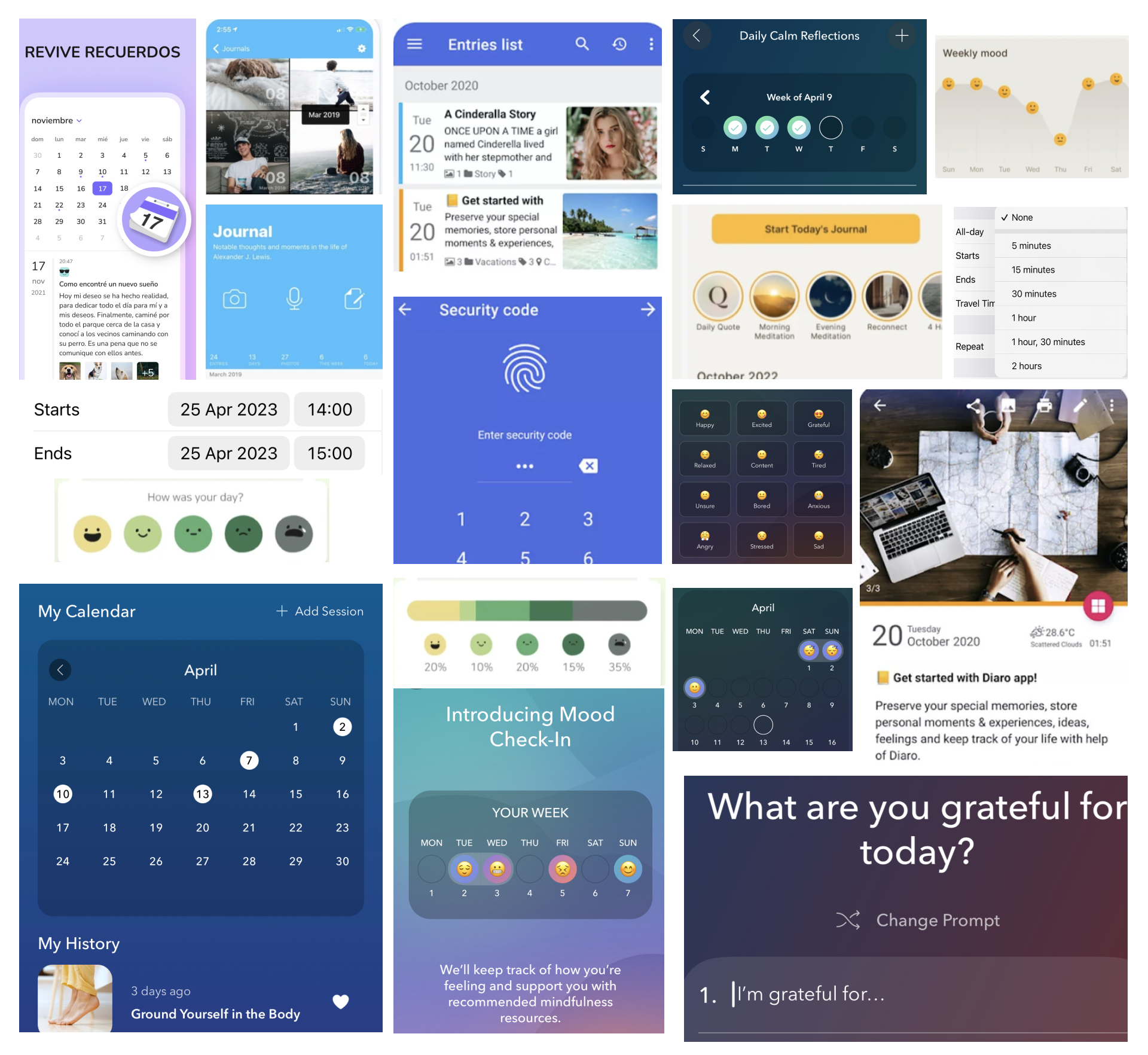
Screens of the following apps: Calm,Daily bean, 5 Minute journal, Day One, iPhone reminders, Diaro
So after collecting a lot of inspiration and analysing amazing different features of diary apps, I decided to take a turn. Designing a complete new app!.
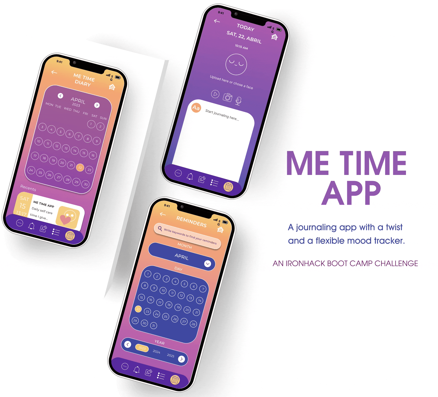
MEET THE ME TIME APP!
THE 5 DIARY SECTIONS
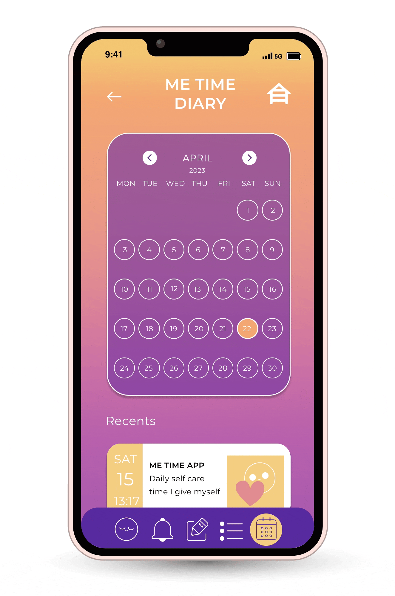
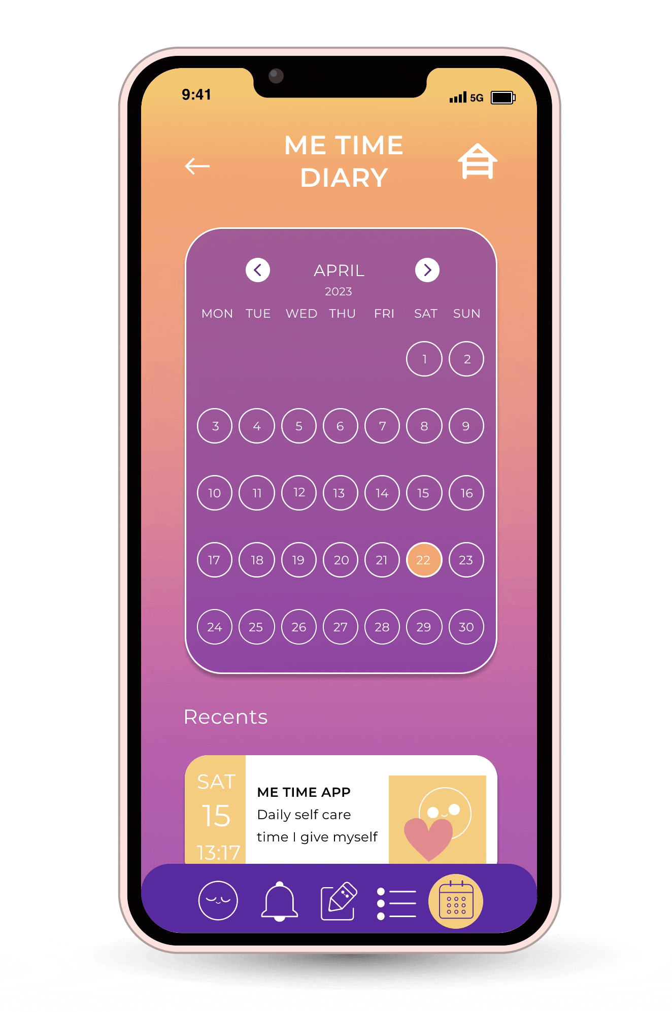
1- THE DIARY HOMEPAGE
For starters a new navigation system was made following the visibility of system status guideline. On the iPhone screen, you can see the current date. Below the calendar, in order to tackle the recalling situation, as done in the previous redesign, a recents area was added. Here you can see your last 4 written entries. This way we can avoid some dates and title recalls. Following the navbar you can see the section where the user is at is highlighted.

2- ENTRY LIST SECTION
It is also natural that we would like to relive and re-read previous experiences we added to our diary. Therefore, to speed up the process of finding older messages, I added a search bar and a month filter. By writing down a keyword, you can easily and more efficiently find your journal entry. Yes some recalling is needed but… now we have the flexibility of filtering with dates or by keywords. Tackleing with this, the Heuristics guideline of flexibility and efficiency .
3- WRITE DOWN YOUR DIARY ENTRY SECTION
Following a simple minimalistic style, you can add a video, photo, or voice note to your entry. Besides adding media, you can of course write your entry. You can also add heirachy to your text with different font sizes and underlining. For example a title could use the largest size and the body could use the smallest size.
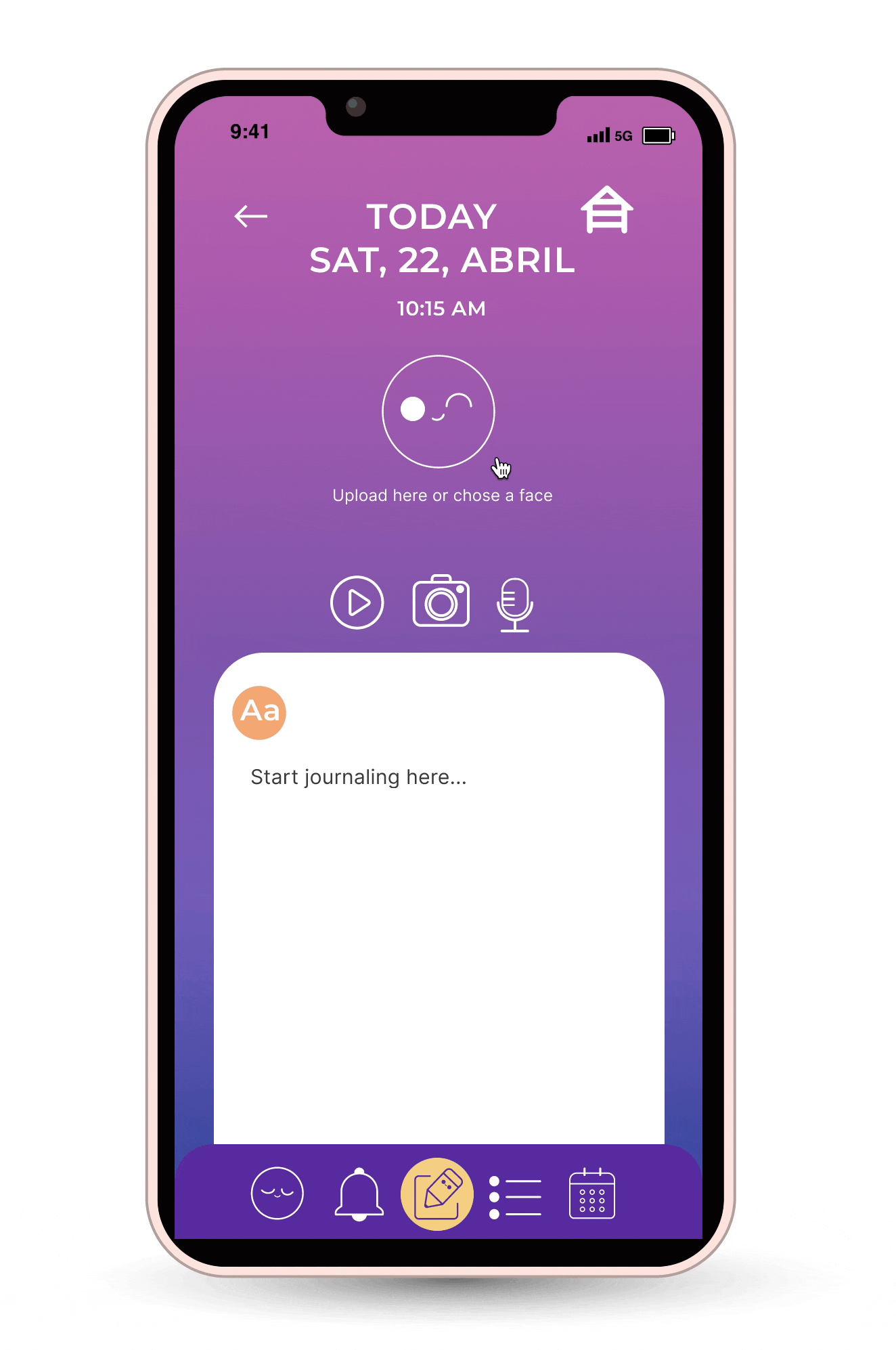
Details make it POP!
A new cute feature of ME TIME , is to add a smiley me time face. Whenever you don't have any media to upload, you simply chose a face. This chosen smiley becomes the cover picture for your entry. Details, details make the difference.
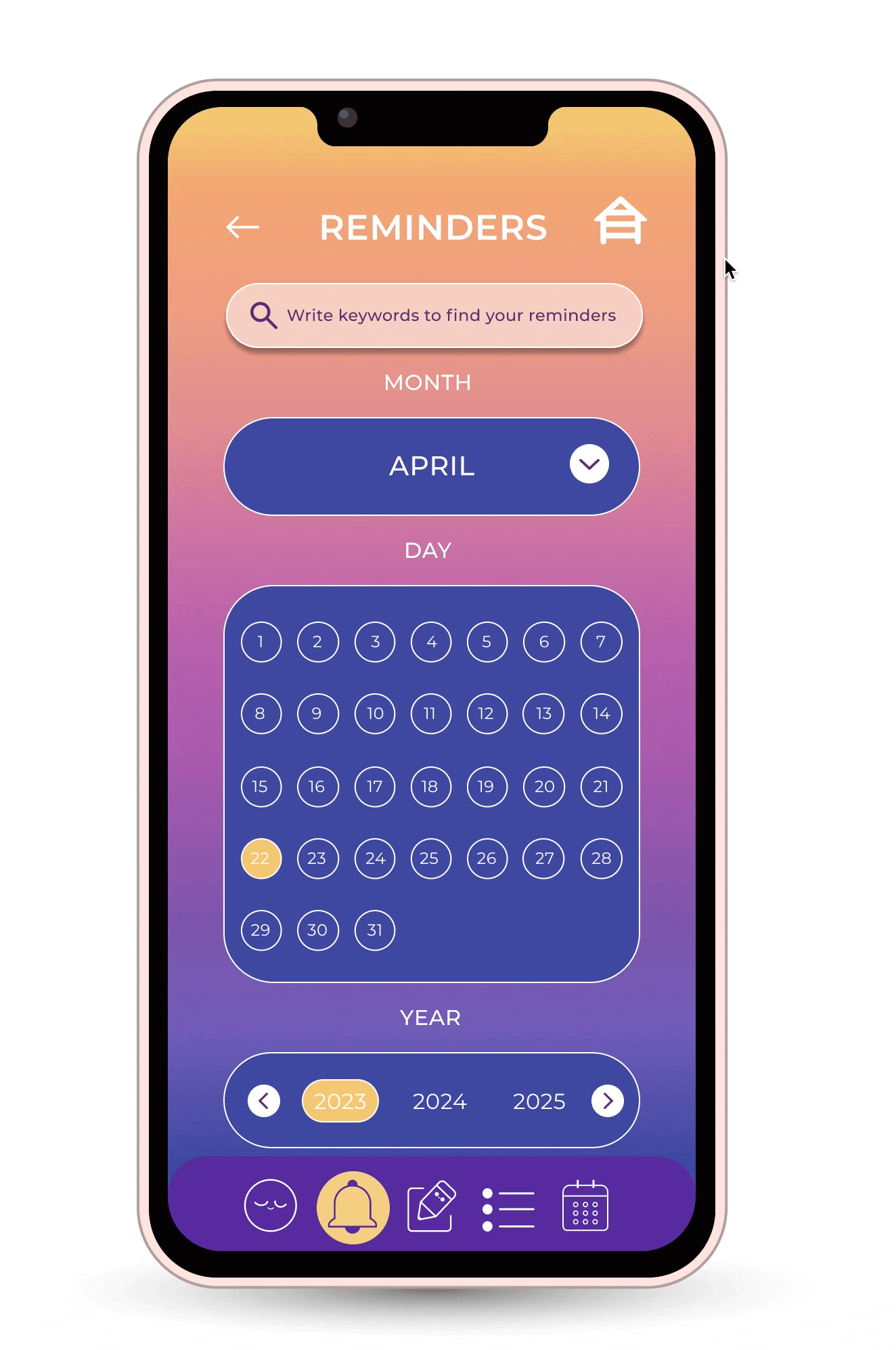
4- THE REMINDER SECTION
The ME TIME app differenciates your journaling entrys from your reminders. Your diary entries can be written on the current day or previous days. The reminders is the section where you can add future upcoming dates, such as birthdays, events, travels, meetings etc. Plus you can custom an alarm to avoid forgetting about it.
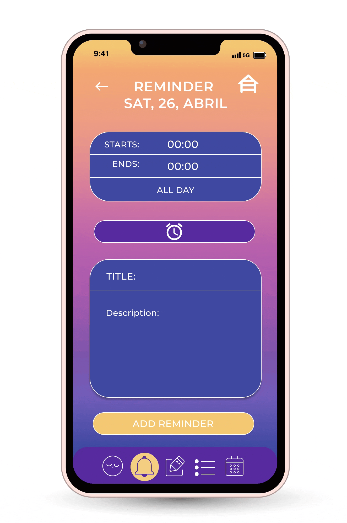
2 design types for setting time
Just for fun, I added two different versions of adding the time for a reminder. Which one do you like more. The clock version or the calculator style version.
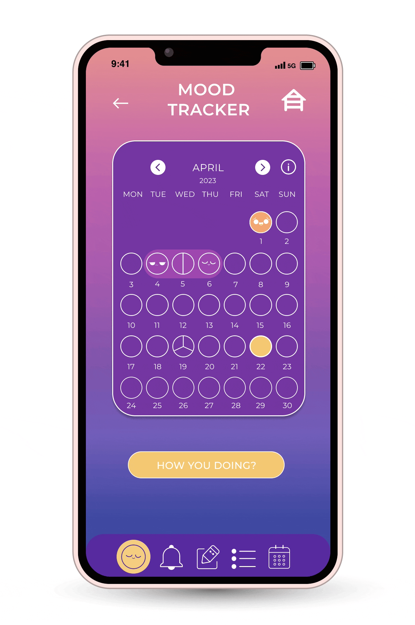
5- MY FAVOURITE SECTION THE MOOD TRACKER
Yes tracking your mood (happy, sad ,angry etc) might not sound too different as of what you can find in the other mood tracking apps. Although I don´t know about you but I, definitely can have more than one emotion ruling my day. Therefore, I wanted to custom the possibility of choosing more than one emotion per day.
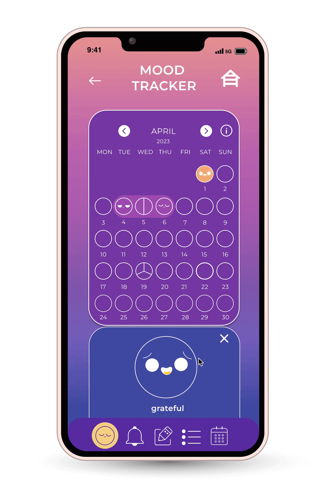
As a former bullet journal lover, keeping a diary with all sorts of tracking things (sleep, habits, water, moods) as well as doodle challenges, gratitude practices, daily planning etc…
I know there is many cool features we could add. What would you like to have in your journaling app? Super open for new ideas suggestions, opinions or design critiques. Thanks for reading it! Have a great day y pura buena vibra!! Saludos enormes Gaby Tatts.