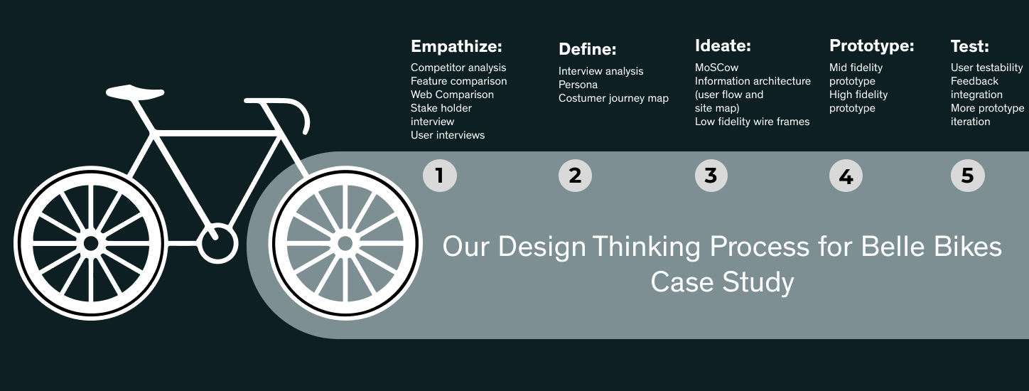
PROJECT OVERVIEW
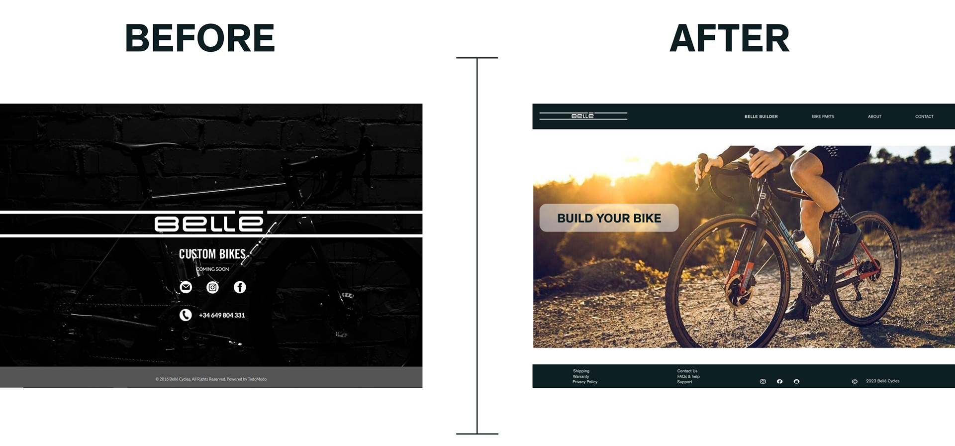
We a group of 3 Gonzalo, Anzhelika and myself Gaby decided to support a real customer Belle Bikes to improve its online presence. They are a small local shop based in Barcelona where Enrico will custom your bike based on your unique measurements.
DESIGN TOOL KIT

MY ROLE
As a team we did the interviews, competitor analysis, we pretty much did everything together except for the phone prototype version. Due to time constraints we divided and conquer. Some focus on the details of the web design prototype and the presentation. While I finished structuring the information and prototyping for the mobile version as well as creating the color changing bike feature.
EMPATHIZE:
First things first, what encompasses a fully customised bike? For the following project, we defined a fully tailored bike as one that differs from a serial production. Where you have no standard medium, small or large frame but rather a fully personalised frame according to your own measurements, selection of components and specs as well as your own aesthetic design taste to give a one of a kind finish to your Bike.
Most of their orders are made via email, phone or by his instagram account.
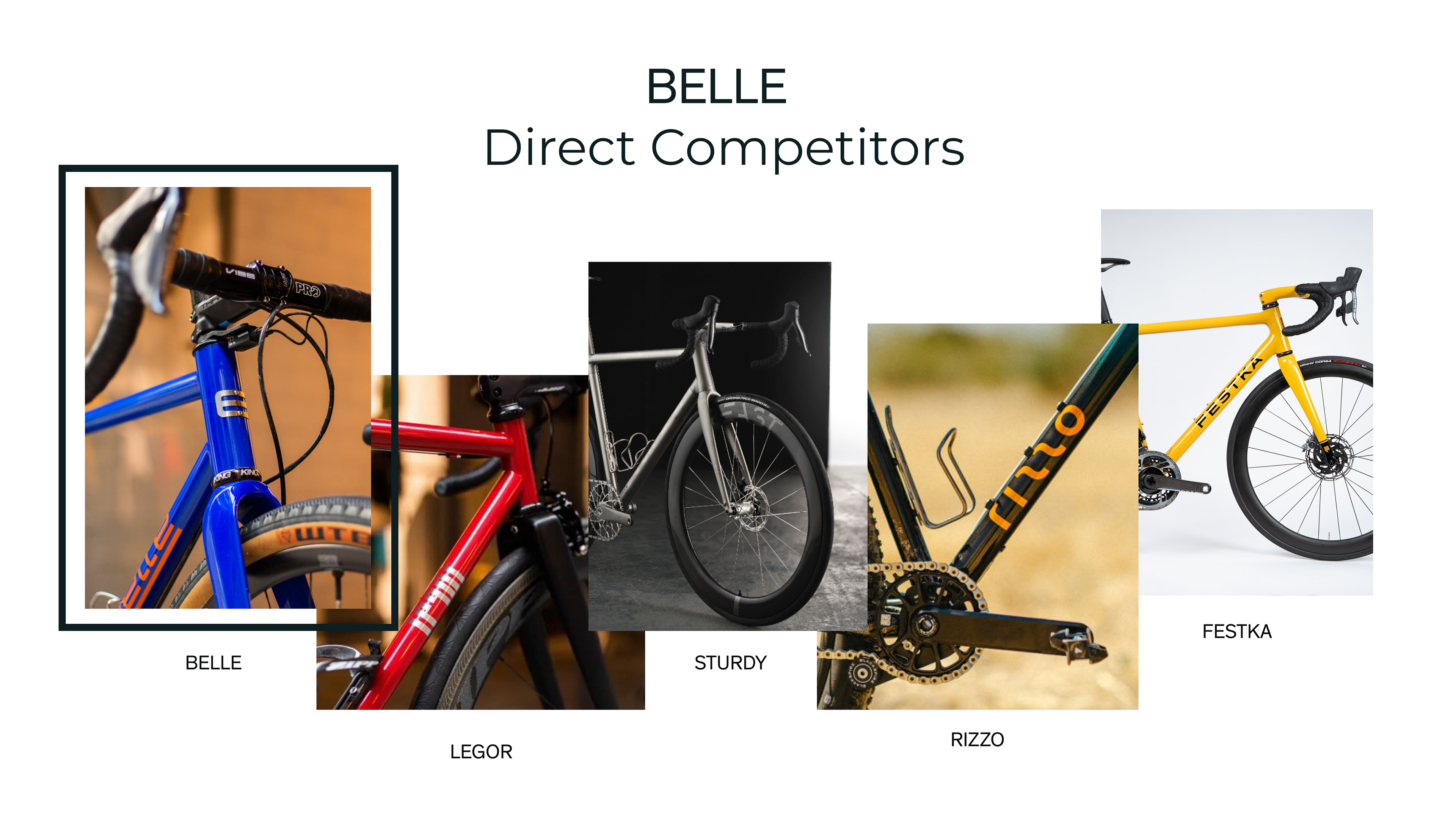
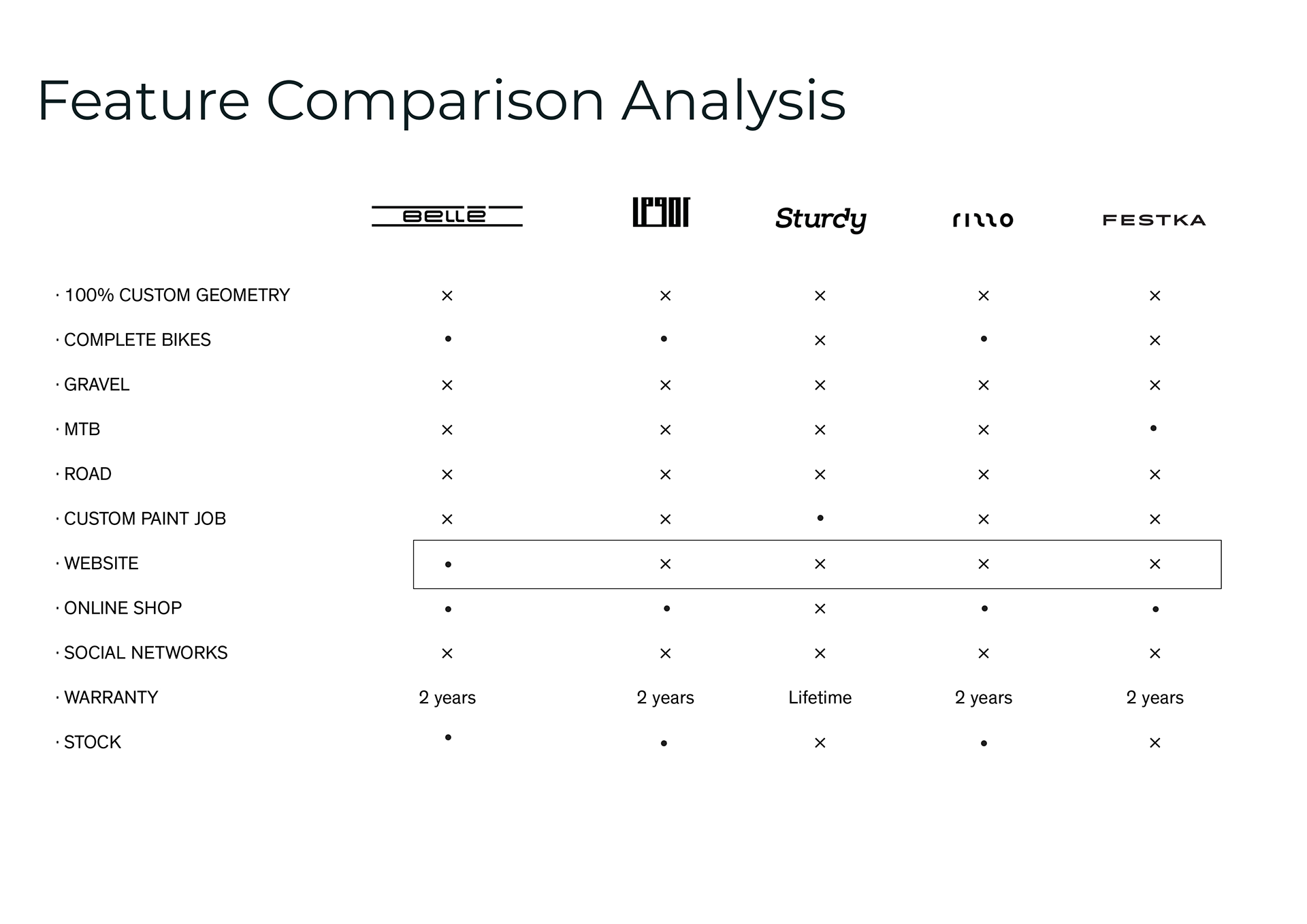
Belle offers a variety of the options customers are looking for when creating a custom bike such as 100% Custom geometry in the three different types of frames: gravel, road, and mountain bike (MTB). Furthermore it was very interesting to observe that all of Belle’s direct competitors small businesses as well as bigger companies have a responsive online website, while Belle only has a landingpage.

DEFINE: (Our Belle Challenge)
Although there are many paint points seen while buying a custom bike, such as unclear information, lack of clear customer care, long estimated delivery dates. We have focused on Clear pricing label as much as possible but mainly we focused on creating a online experience where the customer will have an active role in participating on the process of building their own unique dream bike.
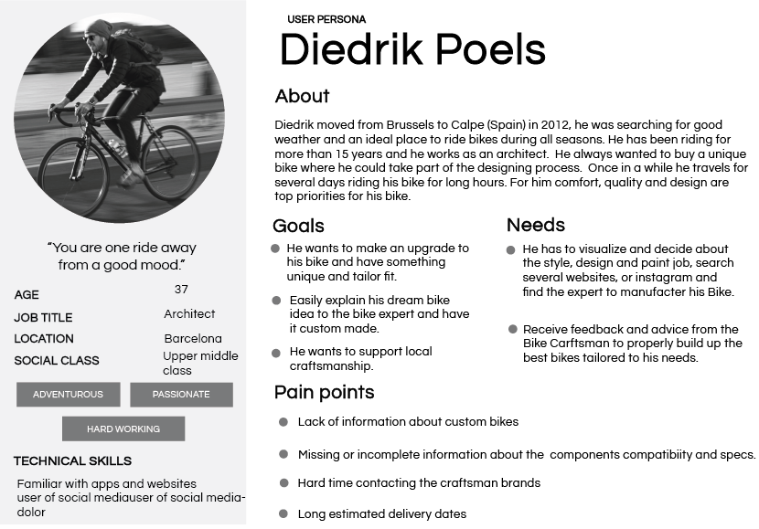
MEET DIEFRIK POELS
Diedrik in summary, uses his bike everyday, cares for style and enjoys extra luxuries such as a nice watch, air pods and fancy sunglasses. Diedrik enjoys supporting craftsmanship and at the same time wants transparency to know exactly where the money is going.
IDEATE:
After some crazy 8s and some more brainstorming ideas we came up with the Belle Bike Builder. A kind of game where users can add each bike part and specs to visually build in real time their dream bike.
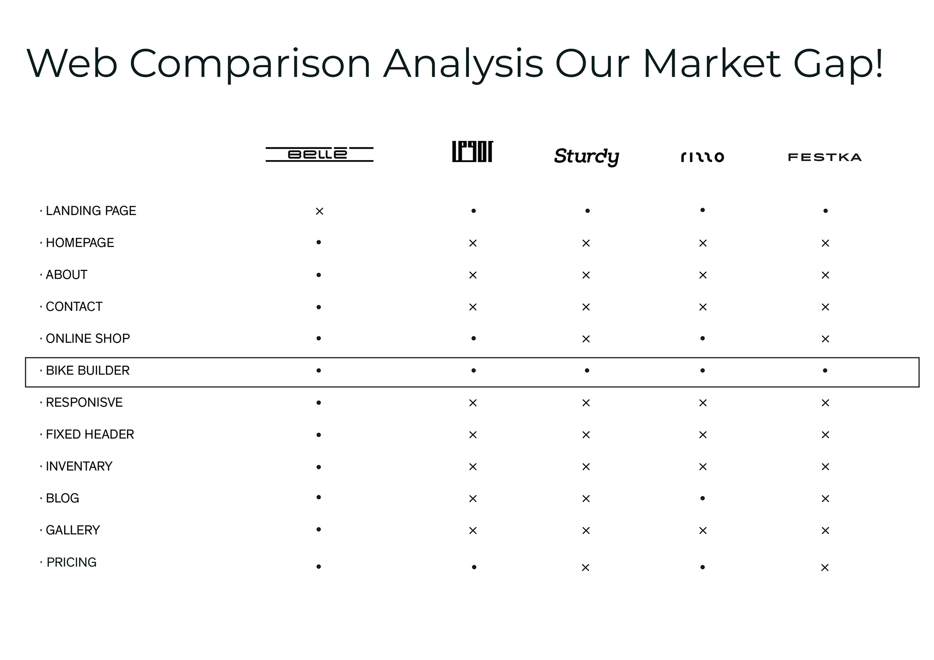
WE FOUND A MARKET GAP
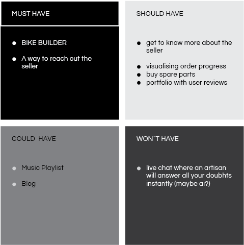
As seen in the picture above Belle’s direct competitors provide their customers a homepage, an about us page and a contact form. Half of them have an online shop and the other half do not have pricing visible. In order to obtain the information you need to contact the artisan. As seen above none of them have a Bike Builder! So we decided to do a MoSCow to prioritise what are the must haves for our prototype and gave structure and hierarchy by designing Belle´s site map.
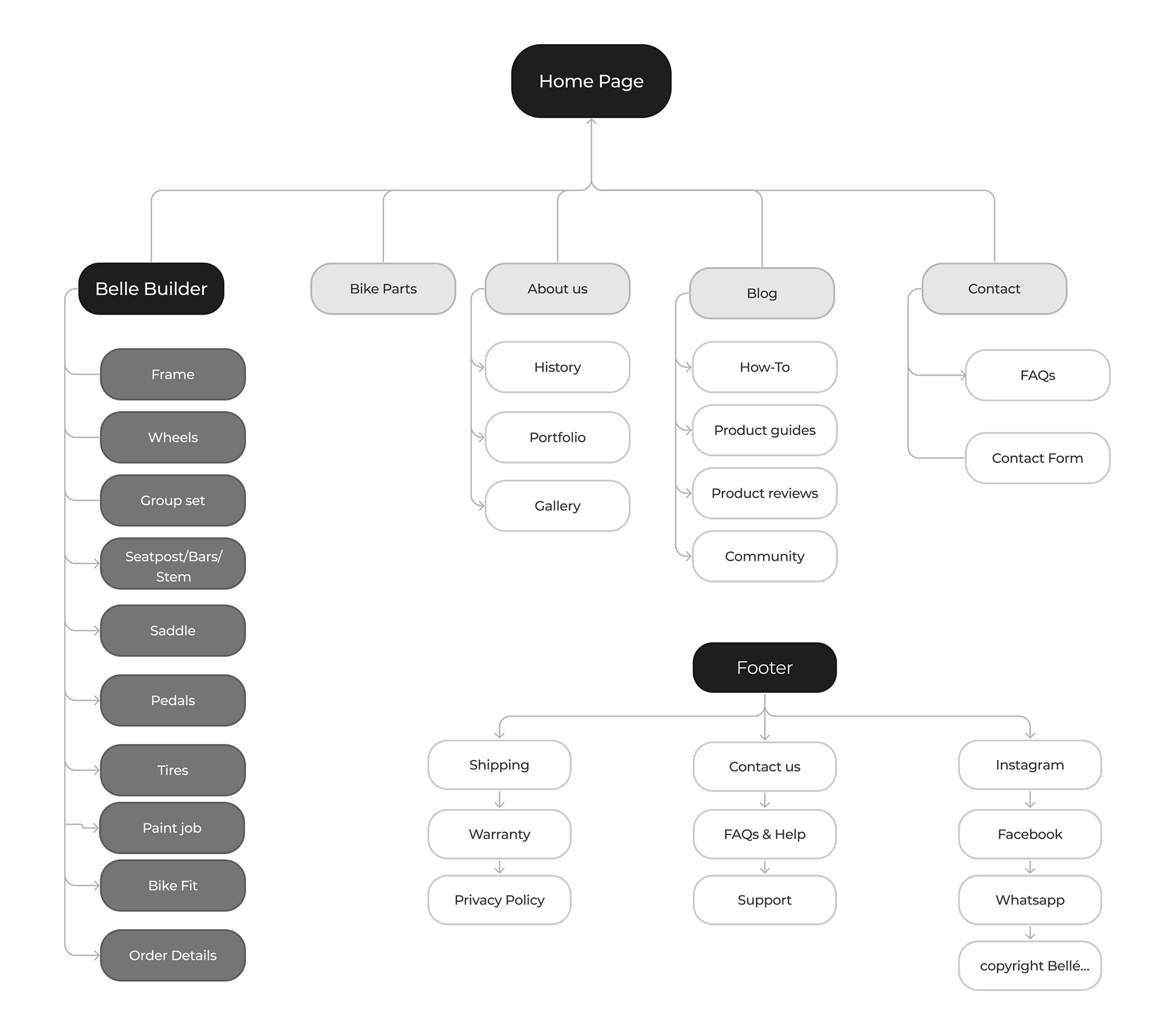
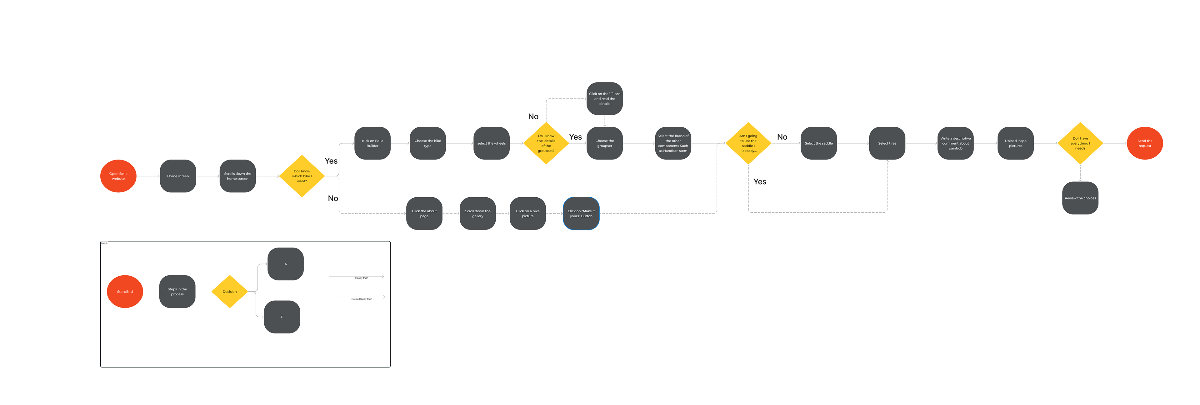
We also created a user flow to fully understand how can we guide Diedrik to a happy path in the process of building his dream bike at Belles website.
PROTOTYPE & TESTING
After several low fidelity wireframes we went up for designing two mid fidelity wireframes to play in a very visual way with different solutions. Some of this solutions encompassed overlays, animations, components and variants. This allowed us to find more paths of showcasing the different options available for each bike part.
After making the final touch ups of our Mid fidelity prototype we set up 5 user testability. The feedback we received was very useful. A very fun fact that occurred to us was, that we completely forgot to add the personal details in the order process. This occurrence really highlighted us the importance of user testability especially in the early stages of wire framing.

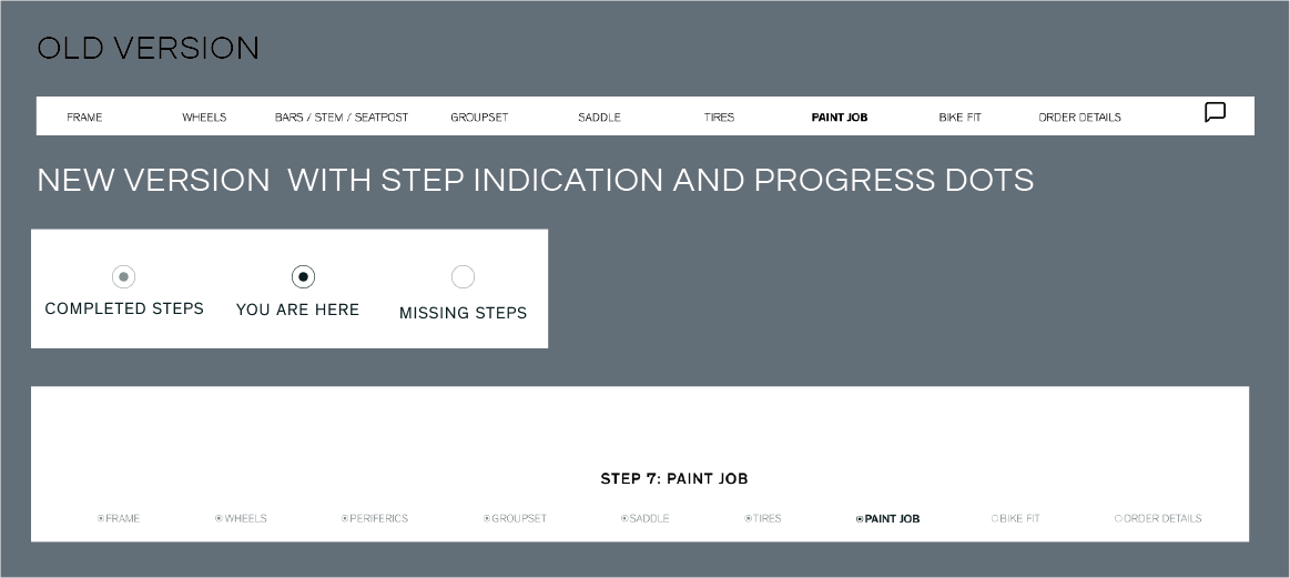
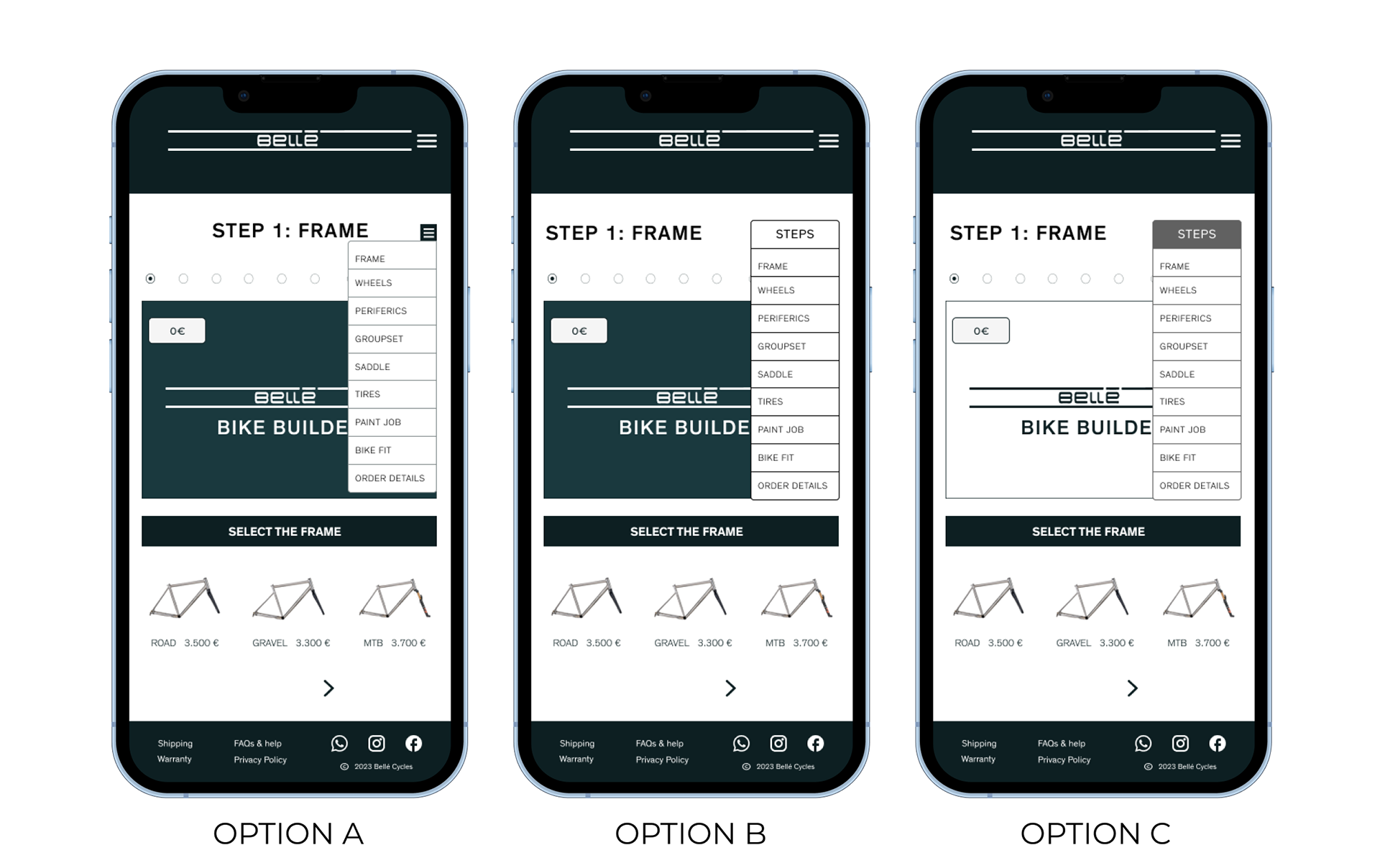
We also got a feed back that the navigation within the bike builder looked as a second nav bar. So we decided to label in which step the costumer currently is and also added the dot progress indicator in order to explicitly show the completed steps, the missing steps and the you are here dot.
After incorporating our user testability feedback to our mid fidelity prototype we focused on the brand attributes (see picture to the right) and made a couple of mood boards to get the look and feel we would like to add to our Belle´s high fidelity prototype.

At the end after revisiting all of Belle’s Bike photos we realise that we needed to stay with a very neutral palette in order to allowed the vibrant colours of Belle Bike pop out!
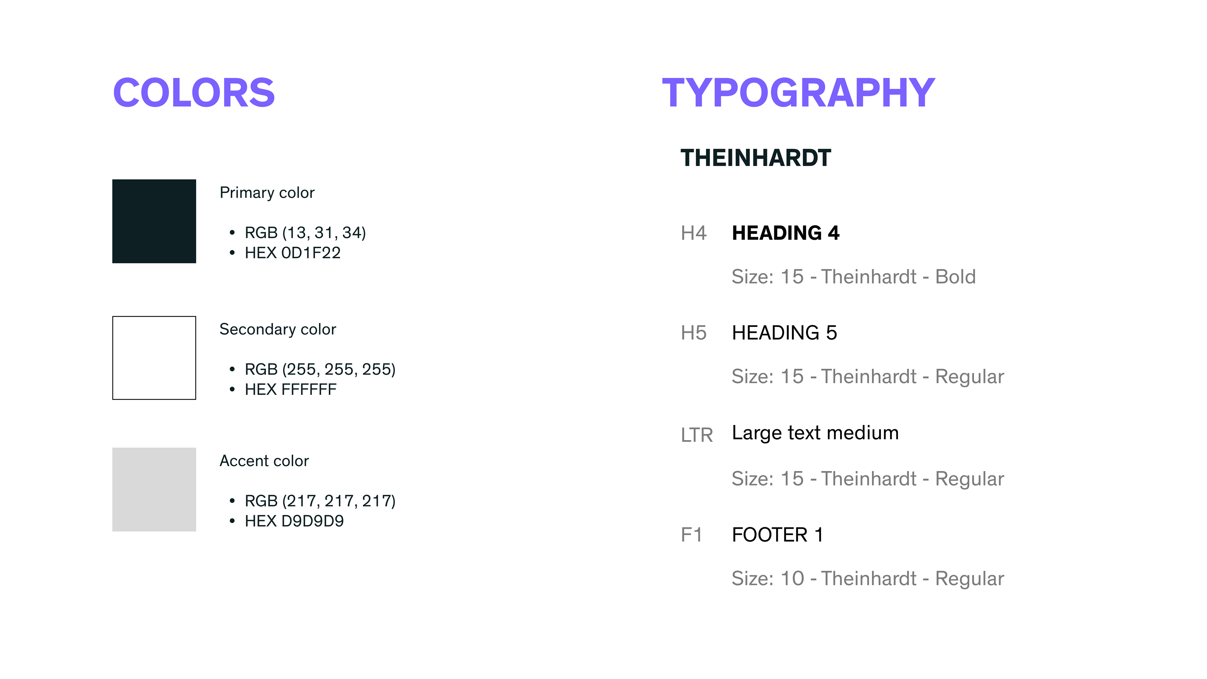
Therefore we kept a black dark grey with bluish undertones as the primary colour, white as a secondary colour and a light grey as an accent colour. For the Typography we chose Theinhardt keeping a minimalist, sturdy and clean typography.
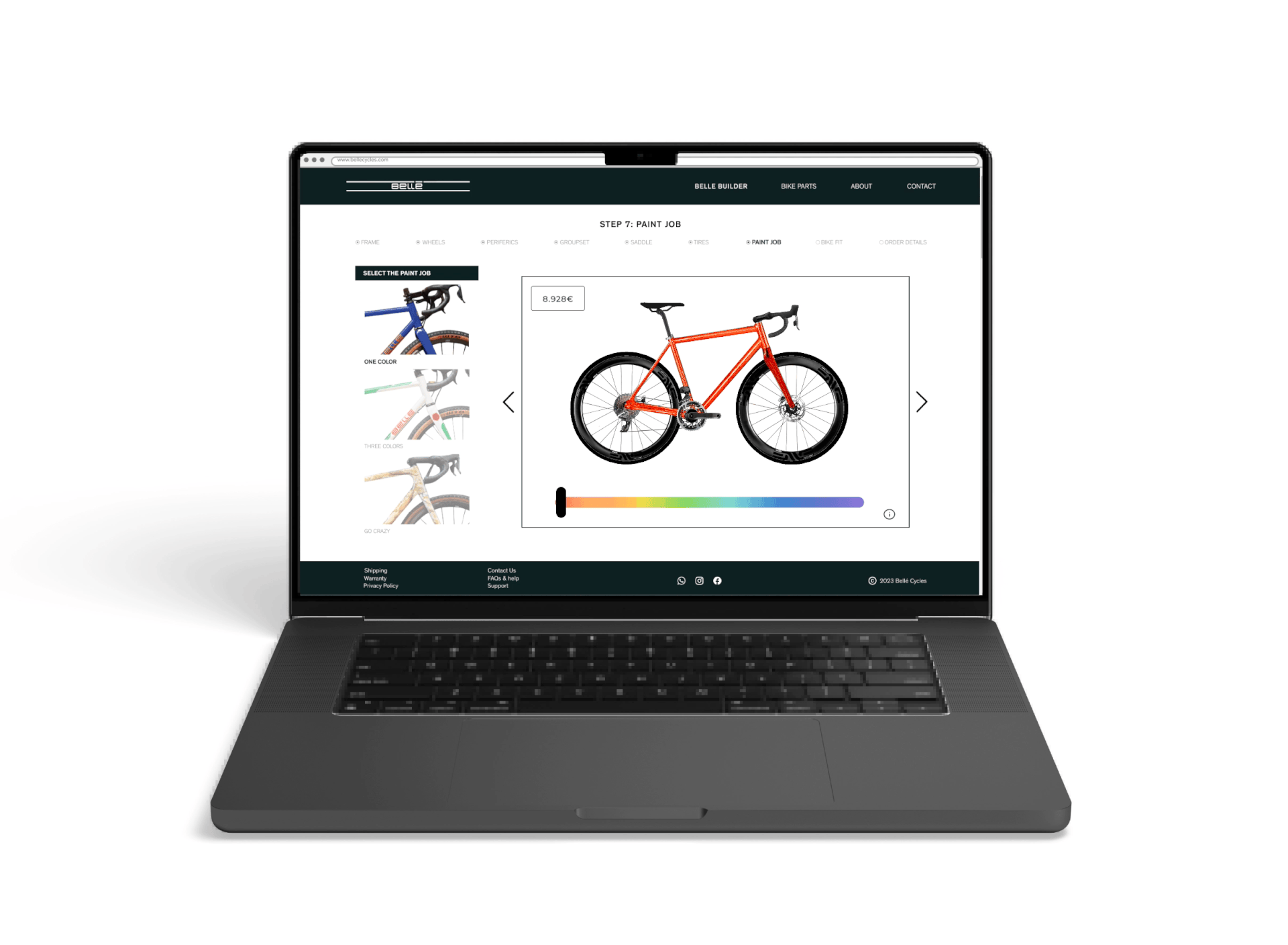
MEET THE BELLE BIKE BUILDER
A new user centred tool that allows the costumer to understand the process of building a bike and participate in the selection of different options and specs in order to create in real time their custom dream bike.
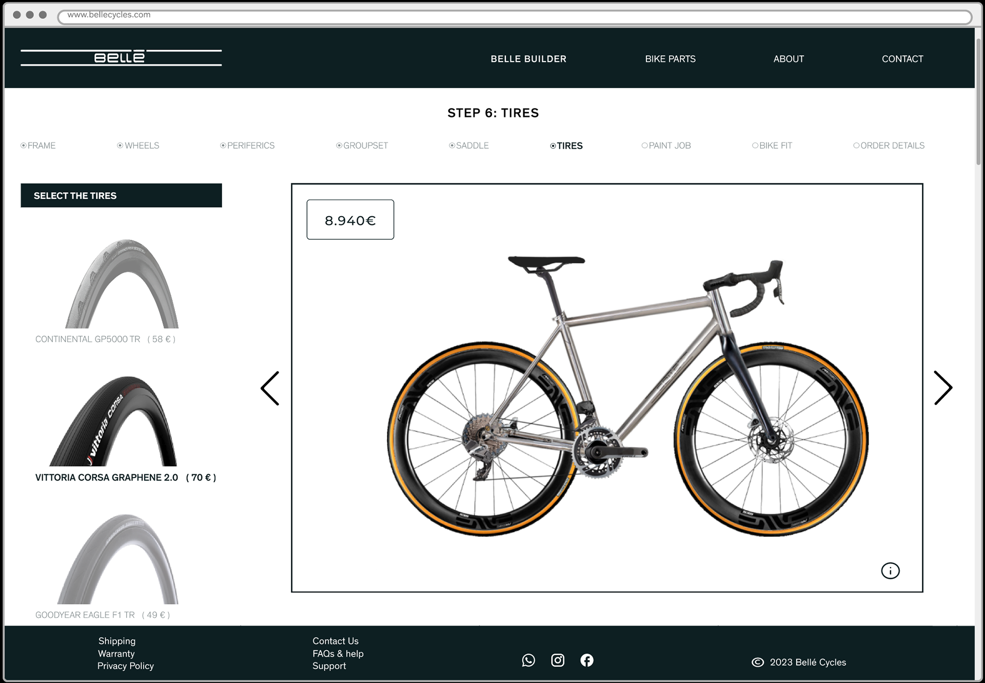
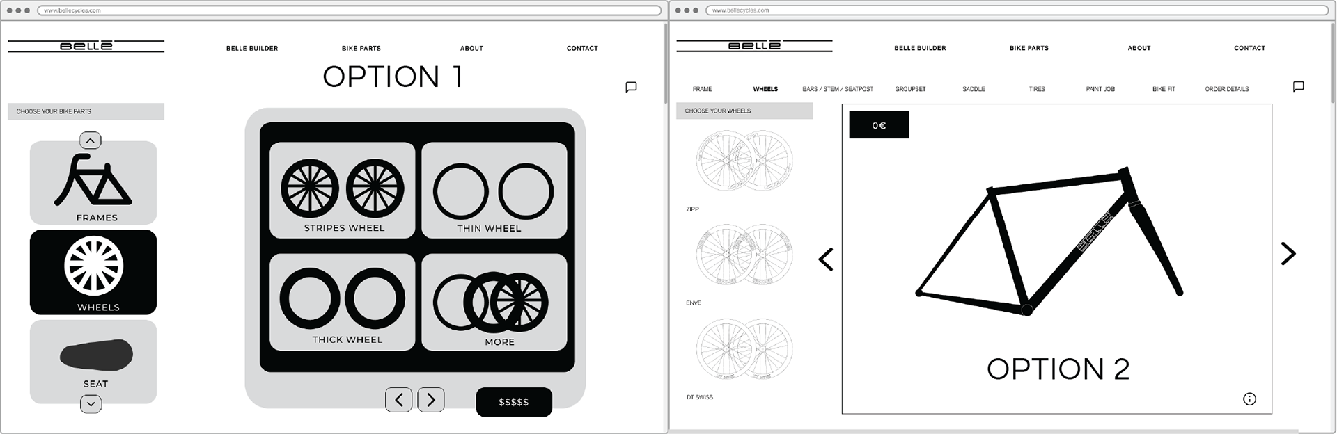
We also did more user testability with our high fidelity prototype. We discovered that people had a hard time differentiating in which option they were standing. We added different opacity to the selection of bike components. For example on the picture above the Vittoria Corsa is the selected option with full opacity (100%) and the other two options have a transparency of 50%.
An additional useful insight was to add extra information customers would like to have at hand when choosing a bike component. Therefore I decided to add a comparative chart with three columns , one for each component. Each row has a different color, facilitating the distinction among each feature within each bike component. Besides having the chart I added an infinite scroll in order to add as much information as Belle requires. By doing so we allow the customers to have all the main information in one page instead of searching in different websites to find the component details.
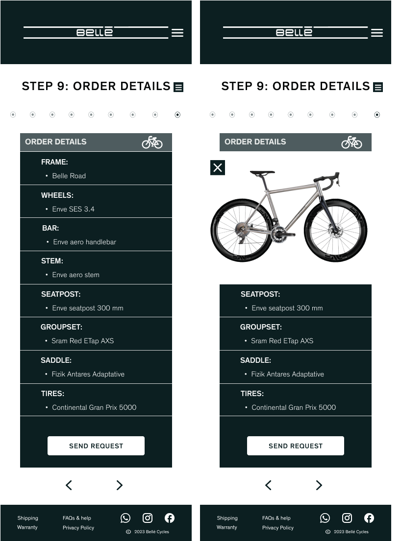
Our Phone Prototype:
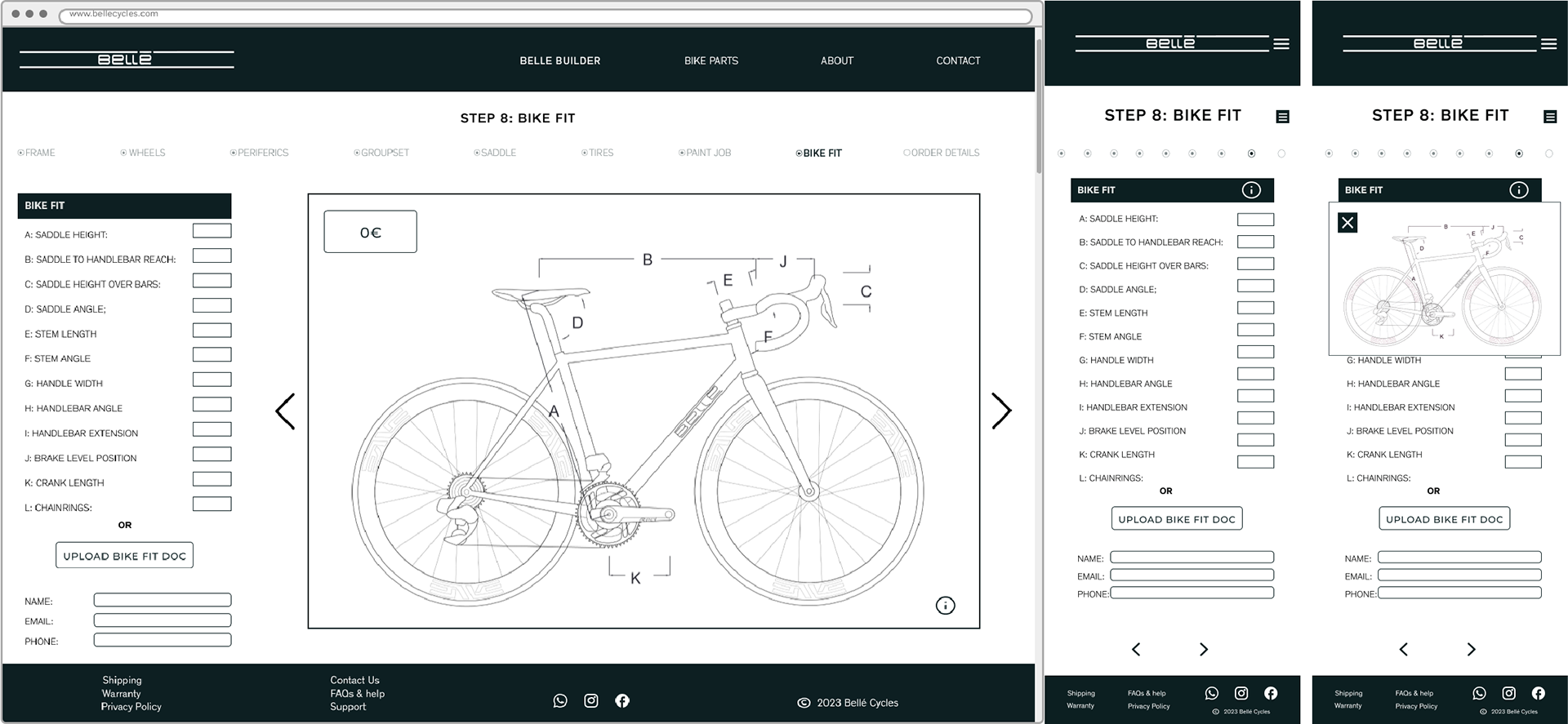
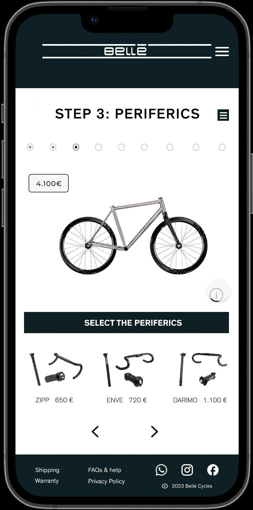
In order to do Belle Cycles website fully responsive we reorganise the information to make it easy to read despite the smaller screen of our beautiful phones. Most of all we really wanted to keep the progress dots and maintain the minimalistic design and style from the desktop in order to repeat the building experience on every screen possible.
Overlays, our best friends
One of the biggest challenges I had was finding balance between displaying all the valuable information available on the desktop version and keeping it clean and minimalistic in the mobile version as well. The solution overlays!
FINALLY OUR BELLE PROTOTYPE DESKTOP VERSION
OUR BELLE PROTOTYPE MOBILE VERSION
NEXT STEPS
As you might have guessed the first next step would be to finish all the other pages for Belle Cycles website. (The about us, the portfolio gallery, the contact form and the online spare parts shop.
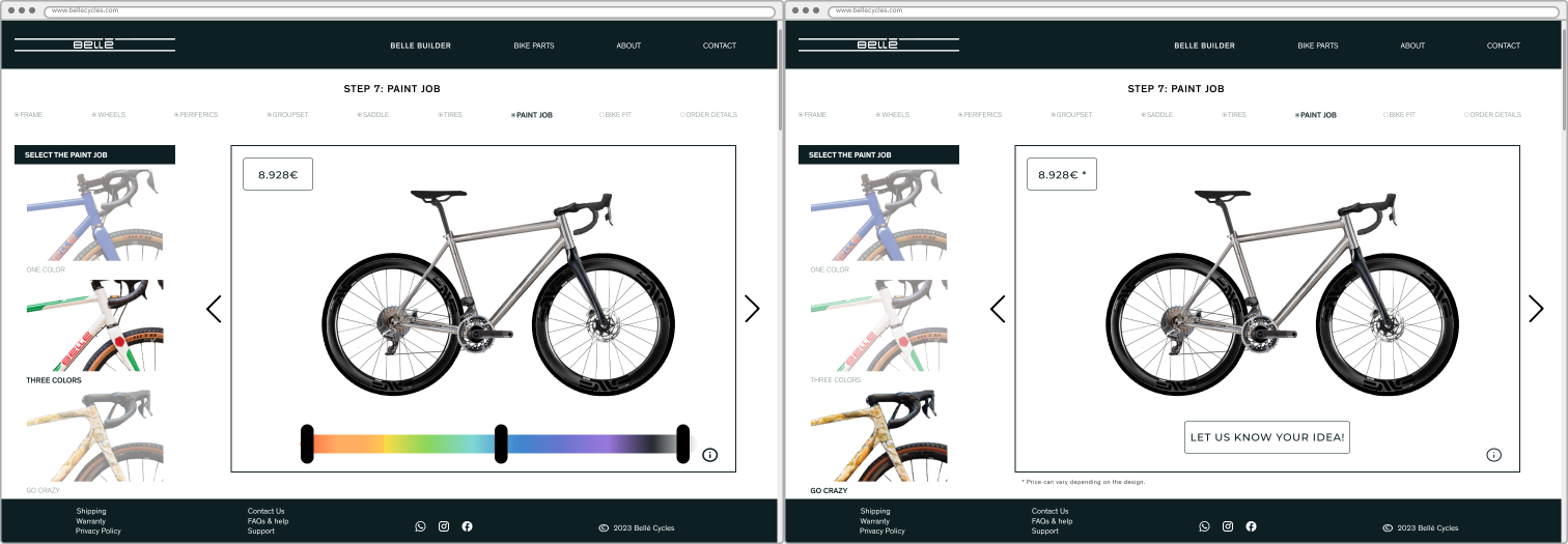
The other offers available at Belle for the Paint Job Section need upgrades. We have not yet decided how to implement new features for the paint job experience. We want to keep it interactive but as crazy open to different design varieties. For example adding a variety of colours or simply allowing the customers to upload their design images and description text.
Thank you for reading this case study. If you have any questions or comments, lets chat, contact me. Have a great day! Saludos Gaby